
| 일 | 월 | 화 | 수 | 목 | 금 | 토 |
|---|---|---|---|---|---|---|
| 1 | 2 | 3 | 4 | 5 | 6 | 7 |
| 8 | 9 | 10 | 11 | 12 | 13 | 14 |
| 15 | 16 | 17 | 18 | 19 | 20 | 21 |
| 22 | 23 | 24 | 25 | 26 | 27 | 28 |
| 29 | 30 | 31 |
- BLE 보안 취약
- 삼변측량
- BLE 보안
- 직선의방정식
- ble
- 해킹 감지 시스템
- RSSI 평활화
- 실내 위치 포지셔닝
- BLE Spoofing Attack
- 플러터
- 플러터 기초
- flutter
- RSSI 전처리
- Flutter 기초
- BLE 삼변측량
- Flutter Positioned
- BLE 실내 위치 측위
- trilateration
- BLE Security
- 삼변측량기법
- 스푸핑 공격 감지 시스템
- RSSI란?
- 실내 위치 측위
- BLE 스푸핑 공격
- 칼만 필터
- Positioned Widget
- Stack Widget
- Flutter Stack
- 위치 정확도
- 실내 위치 예측
- Today
- Total
컨테이너
[Flutter] Scaffold Class 본문
과거 Java나 Kotlin으로 앱을 개발할 때,
한 Screen을 완성하기 위해 메인 화면 뿐만아니라 Appbar(또는 Toolbar), BottomNavigationBar, Drawer 등
다양한 위젯들을 따로 만들어 조합했던 기억이 있습니다.
현재는 주로 Flutter로 Scaffold 위젯을 사용하며 위와 같은 귀찮음이 크게 줄었는데요,
아직 써보지 않으셨다면 이번 기회에 여러 분들도 Scaffold를 한번 사용해보셨으면 좋겠습니다!
Scaffold Class
예제 코드
import 'package:flutter/material.dart';

void main() {
  runApp(MyApp());
}

class MyApp extends StatelessWidget {
  @override
  Widget build(BuildContext context) {
    return MaterialApp(
      debugShowCheckedModeBanner: false,
      title: 'Scaffold',
      home: scaffold(),
    );
  }
}

Widget scaffold() {
  return Scaffold(
    appBar: AppBar(
      title: Text('Scaffold'),
      centerTitle: true,
      // leading: IconButton(
      //   icon: Icon(Icons.arrow_back_ios, color: Colors.white),
      //   onPressed: () {},
      // ),
      actions: [
        IconButton(
          icon: Icon(
            Icons.account_circle,
            color: Colors.white,
          ),
          onPressed: () {},
        )
      ],
    ),
    drawer: Drawer(
      child: ListView(
        children: [
          DrawerHeader(
            child: Text(
              'Drawer',
              style: TextStyle(color: Colors.white, fontSize: 50),
            ),
            decoration: BoxDecoration(color: Colors.blueAccent),
          ),
          ListTile(
            title: Text('Test 1'),
            onTap: () {},
          ),
          ListTile(
            title: Text('Test 2'),
            onTap: () {},
          ),
          ListTile(
            title: Text('Test 3'),
            onTap: () {},
          ),
        ],
      ),
    ),
    body: Center(
      child: Text(
        "Scaffold Practice",
        style: TextStyle(color: Colors.black, fontSize: 30),
      ),
    ),
    floatingActionButton: FloatingActionButton(
      backgroundColor: Colors.blueAccent,
      onPressed: () {},
      child: Icon(Icons.add),
    ),
    floatingActionButtonLocation: FloatingActionButtonLocation.centerDocked,
    bottomNavigationBar: BottomNavigationBar(
      onTap: (index) => {},
      currentIndex: 0,
      items: [
        BottomNavigationBarItem(icon: Icon(Icons.home), label: 'home'),
        BottomNavigationBarItem(icon: Icon(Icons.mail), label: 'mail'),
      ],
    ),
  );
}
저번에 MaterialApp Class를 소개하면서 Flutter가 Material Design을 따르고있음을 설명드렸습니다.
Scaffold는 Material Design의 기본 뼈대(구조)가 되는 위젯입니다.
[Flutter] MaterialApp Class
플러터 프로젝트를 새로 만들면 기본적으로 MaterialApp을 사용해 UI를 생성합니다. 딱히 신경 안 쓰고 개발하다 궁금해서 공부해봤습니다. MaterialApp Flutter는 Material Design을 바탕으로 위젯이 만들어
ahang.tistory.com
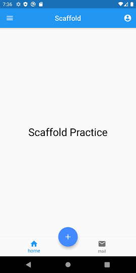
이번 예제 코드에선 대표적으로 사용되는 5가지의 Scaffold 속성을 간단히 다뤄보겠습니다.
AppBar
appBar: AppBar(

      // AppBar의 title
      title: Text('Scaffold'),

      // title의 위치를 center로 지정
      centerTitle: true,

      // appBar의 왼쪽에 위치한 위젯
      // leading: IconButton(
      //   icon: Icon(Icons.arrow_back_ios, color: Colors.white),
      //   onPressed: () {},
      // ),

      // appBar의 오른쪽에 위치한 위젯
      actions: [
        IconButton(
          icon: Icon(
            Icons.account_circle,
            color: Colors.white,
          ),
          onPressed: () {},
        )
      ],
    )
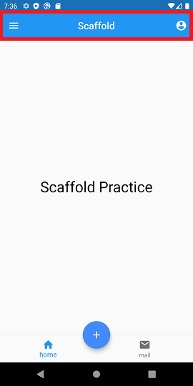
Scaffold의 AppBar 속성을 활용하면 손쉽게 AppBar를 구현할 수 있는데요,
leading과 action 속성을 활용하여 AppBar의 좌우에 다양한 위젯들을 배치할 수 있습니다.
현재 예제 코드에선 Drawer 위젯을 사용하기 위해 leading은 주석 처리해두었습니다.
( 주석을 해제시켜 확인해보세요! )
Drawer
drawer: Drawer(
      child: ListView(

        // Drawer를 디자인하는 부분
        children: [

          // Drawer의 헤더
          DrawerHeader(
            child: Text(
              'Drawer',
              style: TextStyle(color: Colors.white, fontSize: 50),
            ),
            decoration: BoxDecoration(color: Colors.blueAccent),
          ),

          // Drawer의 아이템 목록
          ListTile(
            title: Text('Test 1'),
            onTap: () {},
          ),
          ListTile(
            title: Text('Test 2'),
            onTap: () {},
          ),
          ListTile(
            title: Text('Test 3'),
            onTap: () {},
          ),
        ],
      ),
    )

ListTile 위젯의 onTab 속성을 활용하여 이벤트를 추가할 수 있습니다!
( 예제 코드에서 이벤트는 없습니다 )
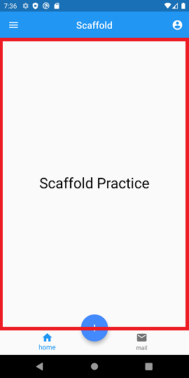
Body
// 메인 화면
body: Center(
      child: Text(
        "Scaffold Practice",
        style: TextStyle(color: Colors.black, fontSize: 30),
      ),
    )
FloatingActionButton
// 버튼 디자인
floatingActionButton: FloatingActionButton(
      backgroundColor: Colors.blueAccent,
      onPressed: () {},
      child: Icon(Icons.add),
    ),
// 버튼의 위치 지정
floatingActionButtonLocation: FloatingActionButtonLocation.centerDocked,
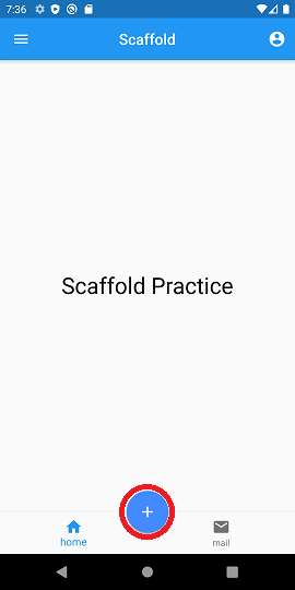
floatingActionButtonLocation 속성을 활용하여 다양한 위치에 버튼을 배치해보세요!
BottomNavigationBar
bottomNavigationBar: BottomNavigationBar(

      // BottomNavigationBarItem 클릭 시 이벤트
      onTap: (index) => {},

      // 현재 클릭 된 index
      currentIndex: 0,

      // BottomNavigation의 item
      items: [
        BottomNavigationBarItem(icon: Icon(Icons.home), label: 'home'),
        BottomNavigationBarItem(icon: Icon(Icons.mail), label: 'mail'),
      ],
    )
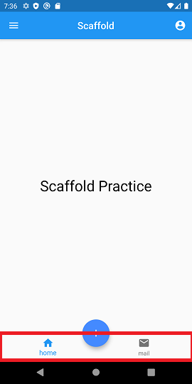
BottomNavigationBarItem은 최소 2개 이상 만들어주셔야 합니다!
더 자세히 알고싶으시다면?!
https://api.flutter.dev/flutter/material/Scaffold-class.html
Scaffold class - material library - Dart API
Implements the basic material design visual layout structure. This class provides APIs for showing drawers, snack bars, and bottom sheets. To display a snackbar or a persistent bottom sheet, obtain the ScaffoldState for the current BuildContext via Scaffol
api.flutter.dev
'Development > Flutter' 카테고리의 다른 글
| [Flutter] SnackBar 위젯 사용법과 응용하기 (0) | 2021.01.20 |
|---|---|
| [Flutter] SingleChildScrollView Class (0) | 2021.01.20 |
| [Flutter] Container Class (0) | 2021.01.19 |
| [Flutter] SizedBox Class (0) | 2021.01.19 |
| [Flutter] Row, Column Class (0) | 2021.01.19 |


